Author Topic: 【IC】 MOO·OON Keycaps Yang·Daytime  (Read 5917 times)

0 Members and 1 Guest are viewing this topic.

Offline MOO·OON

  • Thread Starter
  • Posts: 39
【IC】 MOO·OON Keycaps Yang·Daytime
« on: Sat, 06 March 2021, 14:02:35 »
Yang·Daytime

Hello everyone~

First time here, we are MOO·OON Studio ~. The origin of the name is from MOON.

So the design of our first key cap must, of course, be related to the sun. ~ LOL~

263882-0

263884-1

Source of inspiration for the design from the beginning was that a great Sun often seen in the Vaporwave picture, that Bright fuchsia. I feel that it is very representative.

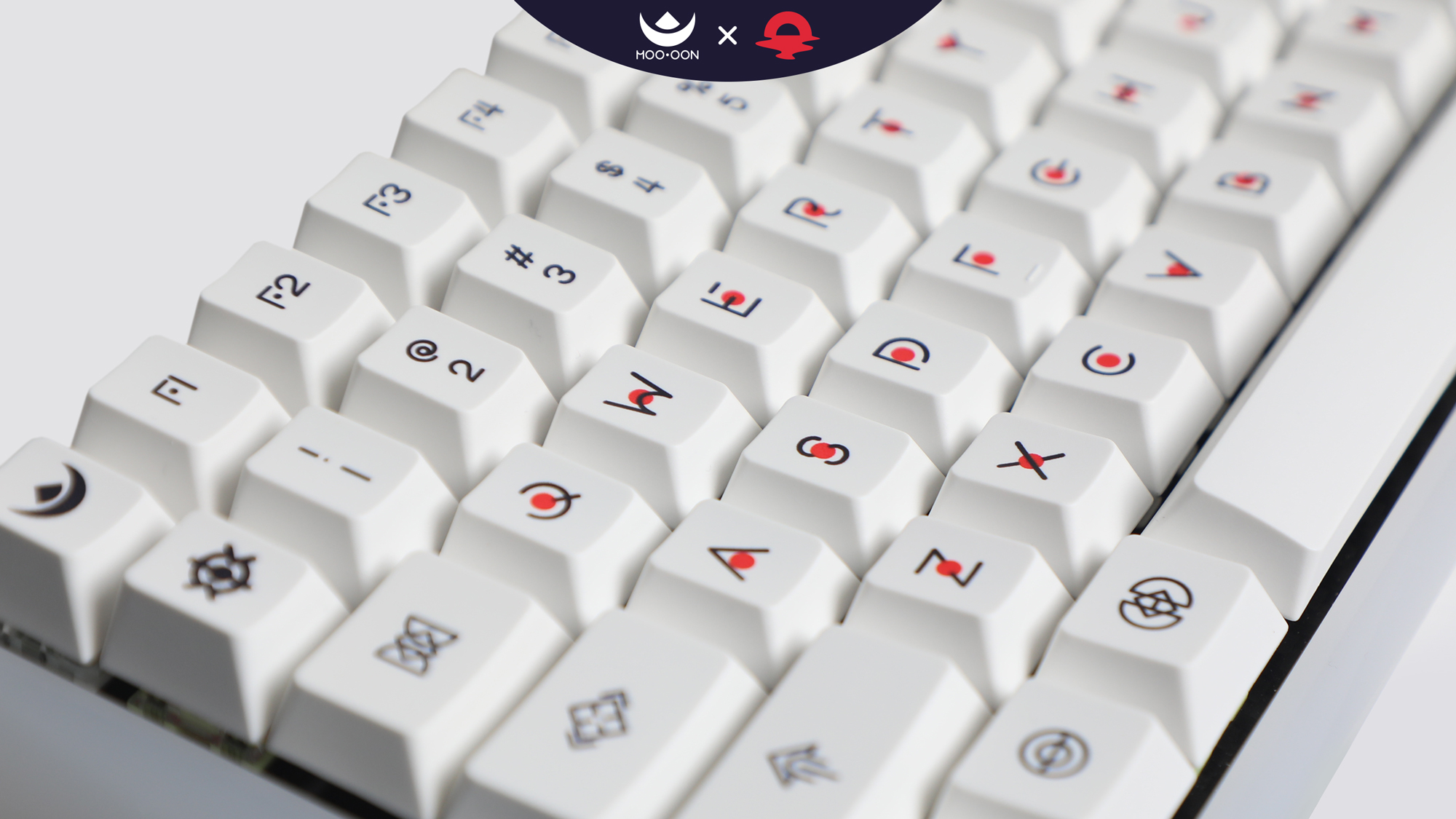
So we designed an alphabet font with a small red dot in each letter (representing a small sun) to be used as a key in the main area.

The commonly used function keys such as ALT, CTRL, and SHIFT are displayed in letters. We considered that for a more unique display, we chose to use simple and symbolic icons instead of letters.

For color schemes and ideas, we refer to some idea from cyberpunk 2077 in the Night City.

One is the main color of deep purple, which symbolizes the psychedelic night of returning to the dead of night after the carnival.

263886-2

Another is blue-violet, like people passing through a carnival illuminated by neon lights in a night market, experiencing this enchanting urban night.

263888-3

The last one is based on milky white, such as the warm breeze of the day, symbolizing the retro nostalgic style of the 80s.

263890-4

the Novelties's inspiration is also from cyberpunk 2077, Mantis Blades. this is a very cool weapon that can be folded. From this idea, I thought the CRKT 4040 Provoke Kinematic. This is also a very cool knife, and its simple and sharp feeling is also very suitable for the overall style.


We decided to make Yang·Daytime for the first time.

After our first proof, we modified the size of the characters and made them slimmer.

This is a photo of some of our samples. Although the shift on the right uses keycaps from other kits, it looks pretty cute.

263892-5

263894-6

263896-7

263898-8

263900-9

263904-10

We are looking forward to a variety of different opinions to help us improve it, thank you all~

zfrontier:https://www.zfrontier.com/app/user/lKbLlJZ0pENq2

E-mail:1067398093@qq.com

QQ group:745363789

Offline NathanAlphaMan

  • Posts: 289
  • Location: Finally Evolved
Re: 【IC】 MOO·OON Keycaps Yang·Daytime
« Reply #1 on: Sat, 06 March 2021, 14:16:12 »
This honestly super cool, love the unique design of these caps.

Just to clarify, is this IC only for the already prototyped "Daytime" set? Or is it for all three sets?
Also, who is the manufacturer of these caps?

Offline eljudio42

  • Posts: 30
Re: 【IC】 MOO·OON Keycaps Yang·Daytime
« Reply #2 on: Sat, 06 March 2021, 14:26:54 »
This honestly super cool, love the unique design of these caps.

Just to clarify, is this IC only for the already prototyped "Daytime" set? Or is it for all three sets?
Also, who is the manufacturer of these caps?

Would also like to know. Very interested in the purple blue colorway


Offline Ciantha

  • Posts: 75
Re: 【IC】 MOO·OON Keycaps Yang·Daytime
« Reply #3 on: Sat, 06 March 2021, 15:20:34 »
I find the red dot in the center of the alphas quite harsh, but I like the overall look of the symbols.
If you have the molds for it adding R2 1.75 backspace, R3 1.25 tab, R3 1.5 enter would add support for many smaller keyboards (40%).

Offline Frayne

  • Posts: 46
  • For deskmat inquiries: illu_zn
Re: 【IC】 MOO·OON Keycaps Yang·Daytime
« Reply #4 on: Sat, 06 March 2021, 18:56:36 »
I also found the red in the set quite harsh and out of place, I would recommand including them in the mods as well (for the dark set), and drop the red sun for the minimalistic look (for the white set at least). As for the purple one, I would suggest a cooler red, almost magenta ish purple. would be really nice!

The mod icons are honestly sooooooo well designed and i fell in love with it at first sight.

https://imgur.com/a/o3OW8jr juuust a suggestion!
« Last Edit: Sat, 06 March 2021, 19:11:48 by Frayne »

Offline dandruff

  • Posts: 226
Re: 【IC】 MOO·OON Keycaps Yang·Daytime
« Reply #5 on: Sat, 06 March 2021, 19:29:44 »
I think the colors, legends, kitting, and novelties overall look great! I do want to know which dye-sub manu you're planning to use for this (well at least I'm assuming it's going to be dye-sub). Also curious about keycap profile.
For now, I think Daytime and Fantasy night are the better two of the three, so I second Frayne's comment (ultimately, your choice as the designer though!):

I also found the red in the set quite harsh and out of place, I would recommend including them in the mods as well (for the dark set), and drop the red sun for the minimalistic look (for the white set at least). As for the purple one, I would suggest a cooler red, almost magenta ish purple. would be really nice!

The mod icons are honestly sooooooo well designed and i fell in love with it at first sight.

https://imgur.com/a/o3OW8jr juuust a suggestion!

Offline MOO·OON

  • Thread Starter
  • Posts: 39
Re: 【IC】 MOO·OON Keycaps Yang·Daytime
« Reply #6 on: Sat, 06 March 2021, 22:00:56 »
This honestly super cool, love the unique design of these caps.

Just to clarify, is this IC only for the already prototyped "Daytime" set? Or is it for all three sets?
Also, who is the manufacturer of these caps?

Thank you very much~

This IC just for "Yang·Daytime".Because it's the first time we've made keycaps,we will only make this one for the time being~
For the next two models, we will release a new IC in a few months.

Its manufacturer is a Small factory in China, not very famous. But they did a good job of single-sided thermal sublimation for that we chose them.
So we may only sell in China this time. Of course, if possible, we will look for overseas agents.
The next two models, we will find a new factory which is more recognized by everyone to make them.

Thanks again~~

Offline MOO·OON

  • Thread Starter
  • Posts: 39
Re: 【IC】 MOO·OON Keycaps Yang·Daytime
« Reply #7 on: Sat, 06 March 2021, 22:14:37 »
I find the red dot in the center of the alphas quite harsh, but I like the overall look of the symbols.
If you have the molds for it adding R2 1.75 backspace, R3 1.25 tab, R3 1.5 enter would add support for many smaller keyboards (40%).

Thank you for your advice~

We may add these to the next two models to support smaller keyboards~


Offline MOO·OON

  • Thread Starter
  • Posts: 39
Re: 【IC】 MOO·OON Keycaps Yang·Daytime
« Reply #8 on: Sat, 06 March 2021, 23:02:26 »
I also found the red in the set quite harsh and out of place, I would recommand including them in the mods as well (for the dark set), and drop the red sun for the minimalistic look (for the white set at least). As for the purple one, I would suggest a cooler red, almost magenta ish purple. would be really nice!

The mod icons are honestly sooooooo well designed and i fell in love with it at first sight.

https://imgur.com/a/o3OW8jr juuust a suggestion!

Thank you for your support~

It's true that some people have given me feedback that they like simpler design and want to remove red dots.

But as I thought at the beginning, they are a very important part of the theme “Yang”.

In China, “Yany” is not only about the sun,It's a rhythm, Yin and Yang harmony. It's like the sun and the moon. And our studio's name source the moon,so we want the first design element to be related to the sun. This is also a kind of adjustment.  ~LOL~

After that, we will consider whether to make a kit about this red dot.

Thanks again~~

Offline MOO·OON

  • Thread Starter
  • Posts: 39
Re: 【IC】 MOO·OON Keycaps Yang·Daytime
« Reply #9 on: Sat, 06 March 2021, 23:29:31 »
I think the colors, legends, kitting, and novelties overall look great! I do want to know which dye-sub manu you're planning to use for this (well at least I'm assuming it's going to be dye-sub). Also curious about keycap profile.
For now, I think Daytime and Fantasy night are the better two of the three, so I second Frayne's comment (ultimately, your choice as the designer though!):

I also found the red in the set quite harsh and out of place, I would recommend including them in the mods as well (for the dark set), and drop the red sun for the minimalistic look (for the white set at least). As for the purple one, I would suggest a cooler red, almost magenta ish purple. would be really nice!

The mod icons are honestly sooooooo well designed and i fell in love with it at first sight.

https://imgur.com/a/o3OW8jr juuust a suggestion!

Thank you for your support~

Its manufacturer is a Small factory in China, not very famous. And the keycap profile is Cherry (1-1-2-3-4-4)~

Offline HappyB0T

  • Posts: 435
  • Location: Midwest, USA
  • I'm a Piggie
Re: 【IC】 MOO·OON Keycaps Yang·Daytime
« Reply #10 on: Sun, 07 March 2021, 16:57:34 »
The white set is the clear winner to me - lots o negative space to support the weight of the design. Kudos for doing something totally different!

Offline MOO·OON

  • Thread Starter
  • Posts: 39
Re: 【IC】 MOO·OON Keycaps Yang·Daytime
« Reply #11 on: Sun, 07 March 2021, 20:36:09 »
The white set is the clear winner to me - lots o negative space to support the weight of the design. Kudos for doing something totally different!

 I am glad you like it ~  :D

Offline kumori

  • Posts: 83
  • Location: Canada
    • polartype
Re: 【IC】 MOO·OON Keycaps Yang·Daytime
« Reply #12 on: Sun, 07 March 2021, 21:39:59 »
Looks great! :)
I love the white keycap version

Please check PM


Offline mamram93

  • Posts: 1
Re: 【IC】 MOO·OON Keycaps Yang·Daytime
« Reply #13 on: Fri, 02 April 2021, 05:12:19 »
is it thick pbt?

Offline Aeyeon

  • Posts: 4
Re: 【IC】 MOO·OON Keycaps Yang·Daytime
« Reply #14 on: Fri, 02 April 2021, 13:39:28 »
Looks like hxh alphabet. Kinda lit though.

Offline Cubic // esc lab

  • Formerly 'esclab'
  • Posts: 459
  • Location: San Francisco
    • esc lab
Re: 【IC】 MOO·OON Keycaps Yang·Daytime
« Reply #15 on: Fri, 02 April 2021, 15:53:02 »
Is this affiliated with Kon Mono at all by any chance? I see quite a bit of the color resemblance with the warm pink and purple.