Great to see more love for the good old Commodore 64.
Good work so far. For feedback I'd like to share my initial feelings upon seeing this:
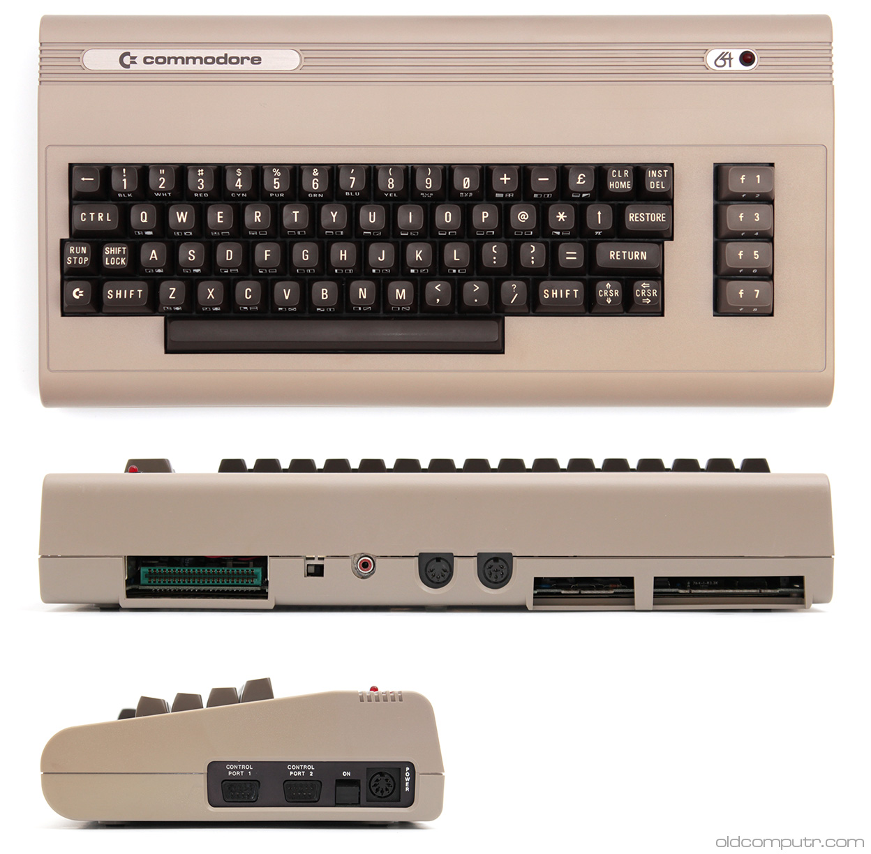
Command 65 LogoWhile the Commodore Logo Type has changed during its lifespan the digits have always remained the same. With a tiny exception of the silver labels, the 64 digits had been set in Eurostile/Microgramma font. To me this is crucial in getting the retro vibe. If the case color is of the original brown then I'd expect the full use of Eurostyle.
.jpg) Front Bevel/Rounding
Front Bevel/RoundingThe bottom front rounding looks fully cylindrical, actually too much so. The C64s is a little flatter. The fact I'm bringing this up is, your current rounding reminds me more of an IBM Model M than a C64.
 Back
BackThe C64 has a slant on its upper housing. I always thought this was quite unique. Also see the front rounding in this image.
 Top recesses
The top recesses to the rear seem a little shallow sort of half way there. I always thought this design element is the most prominent and deserves fine tuning. Also notice the slight angle on the original.
KeycapsThe Cherry/OEMs keycaps don't work for me at all this is not the face of the C64. In comparisson, the C128 had cylindrical keycaps, making it much more professional/office looking. For me a C64 design needs a high spherical sculpted profile. Current available profile options that may work are MT3 and SA in that order. Maybe check out Jim Drews project on kickstarter.
To me the keycaps are a make or break situation.I wish you the very best and hope you find this feedback helpful.


