Hello Geekhack,
For a while now, I've thought about trying my hand at designing a keyboard, and now is as good a time as any. I have no idea where exactly this will go, but my end goal is to have something that will be usable at the end. I'll come back to this post and update it as I progress in the hope that by documenting my process of learning and experimenting it may help others in the future. As I go, I may make some mistakes as a part of the learning process, but I look forward to hearing feedback as I go to help fine-tune my design.
Please note that while I would encourage anyone looking to design a keyboard to use this design log as a way to learn from my process and mistakes, I also encourage that this is applied to your own original ideas. In other words, please learn from this design log, but do not copy my design.
7/23/2020
I've done some playing around with the keyboard layout editor, and I think I have a layout I am happy with. It was partially inspired by the 1800 style layout with the offset arrow keys, and then I played around until everything else was square. I would like to be able to support ISO and split spacebar layouts.
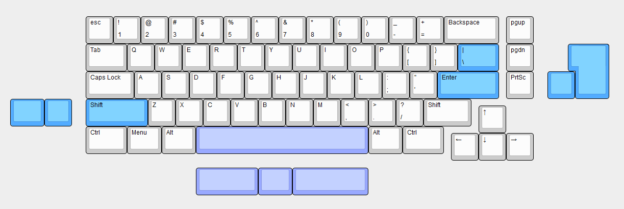
I am interested to hear some thoughts on this as I am always looking for feedback to keep iterating.
_M47
7/24/2020
With a layout defined, I started to think about the design of the case. The drawing below is very rough as my sketching skills are somewhat mediocre, but the point is just to have some sort of idea or reference that I can look at in the future and get a more accurate sense of what I was thinking at the time in terms of the design vision. As well, it is the first point where I can look at the idea and see what I like and what I don't.
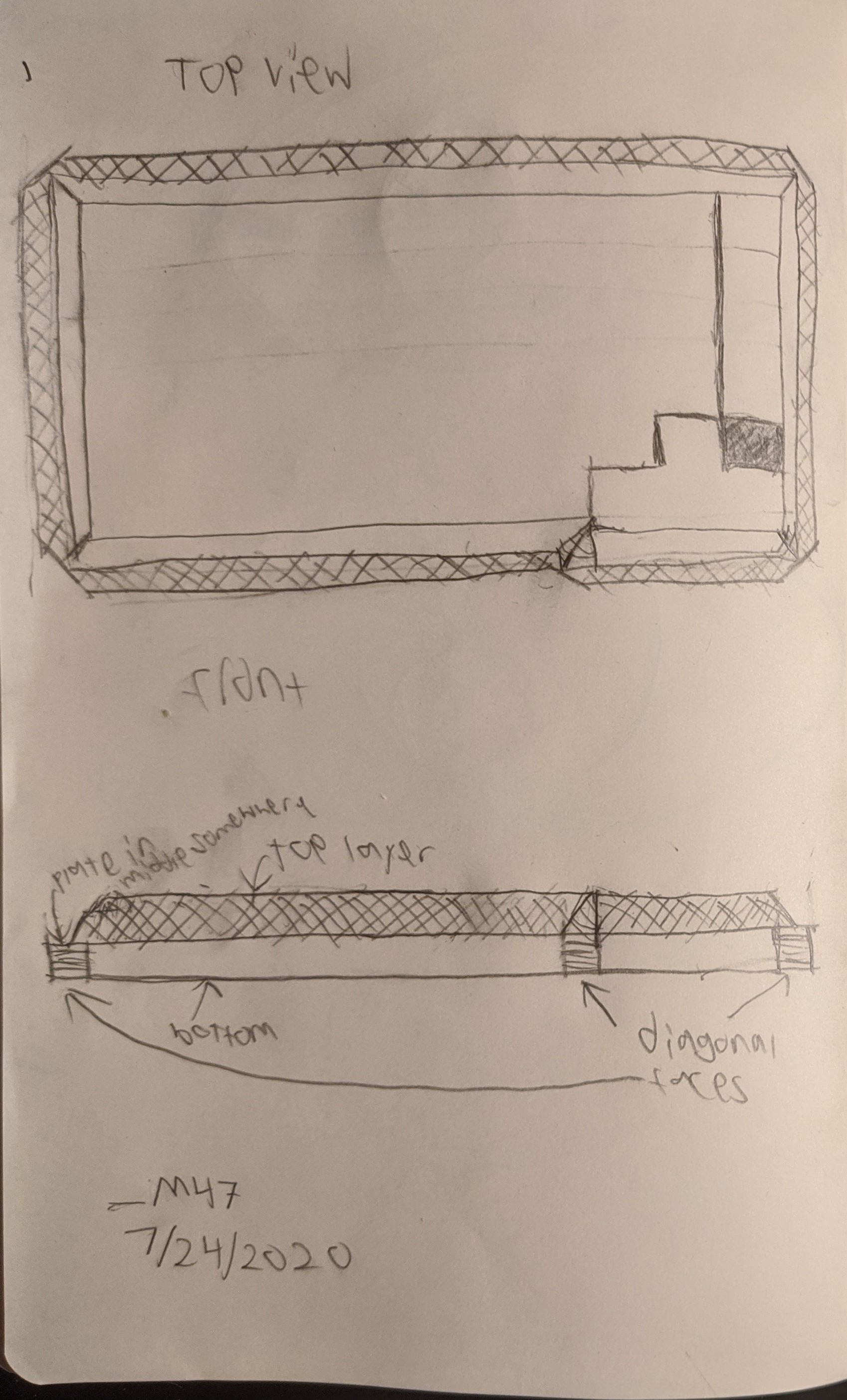
I think I'd like the case to be a bit more angular rather than organic. I am feeling inspired by brutalist architecture right now and I think that a keyboard based on it could be quite cool. Another thing that this preliminary sketch helped me define is that I want the case bezel to follow the "broken away" 1800-style arrow keys. I think the resulting asymmetry will be very interesting to combine with the brutalist architecture based theme. One thing I don't like about this design is that corners of the top of the case (non-crosshatched section) come to a point, but the lower half comes to chamfer.
_M47
7/25/2020
Now that I have a better idea of some of the things I want in this design, I took more time to create a slightly more refined sketch.
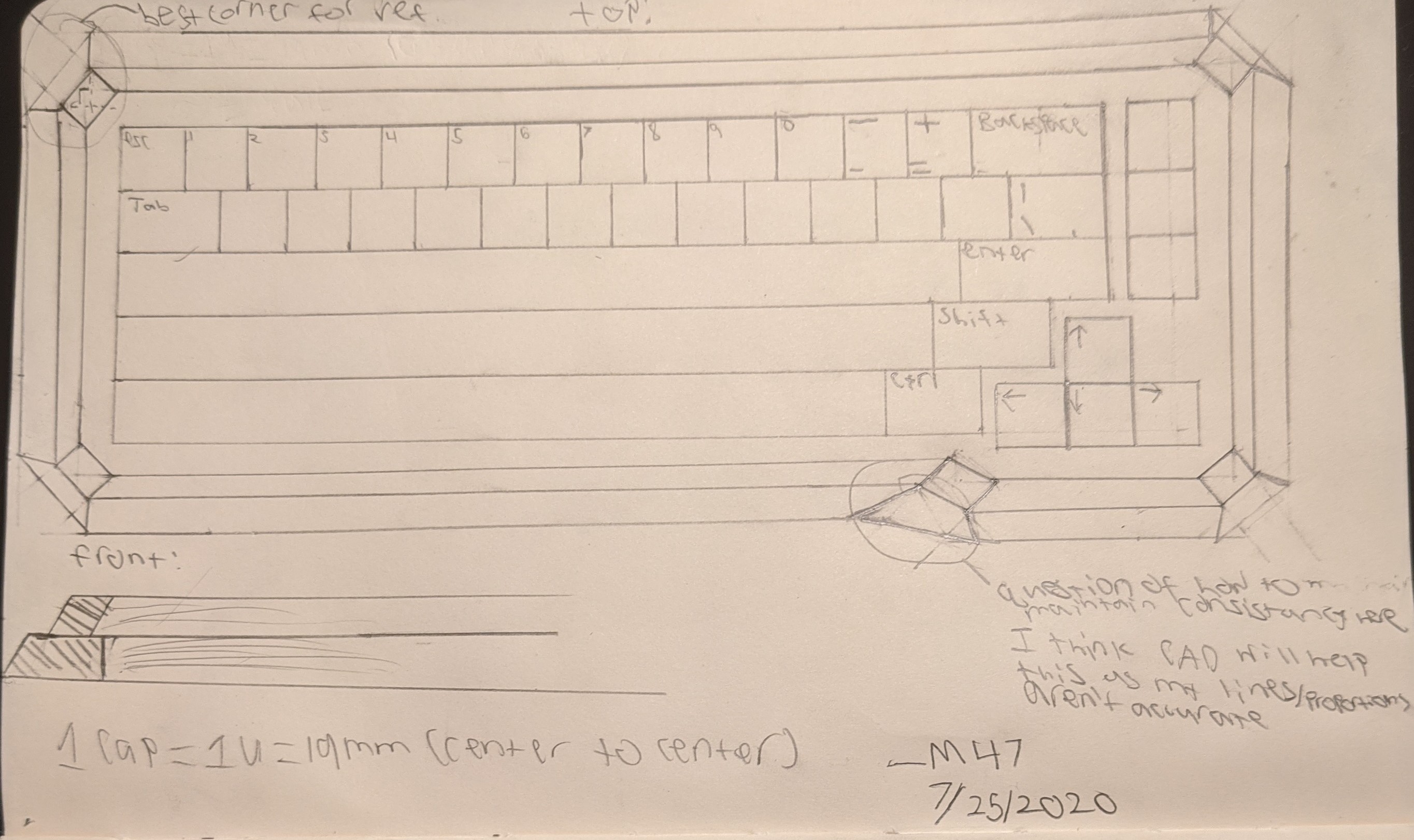
This serves as an iteration of my previous sketch. I kept the same overall profile, but instead of going to a point at the corners, the top layer will now go to a chamfer. I spent a bit more time on this sketch meaning it is a bit easier to get some meaning from. There is a scale of 1 unit = 1 cm (around half scale), but that is somewhat loose due to the limitations of my drawing skill as can be seen in the corners. Because of this, I think that my next step will be creating something like this in CAD, and after that, 3d printing a prototype. As I move into CAD, I have a few lessons from this sketching process. First, the transition from the broken away arrow keys to the rest of the board will be tricky to manage while keeping it consistent with the rest of the corners. This should get resolved in CAD as I think the issue had to do with my drafting ability and will be easier with geometric constraints. Secondly, I need to think about how the top of the case will meet the bottom. In the front view, I playing with the idea of having a sort of "step" in between, but I could also have the joint between the two halves be flush and then change the drafted angle to create some bit of difference, amongst many other options (maybe a notch or an angled step). This also reinforced the idea that this is iterative. It may be that as I create a model of this, either in the CAD or 3d printed prototype stage, it might not be what I want. If that happens, I will take what I've learned to further define how I want the case to ideally look and repeat the steps.
_M47
7/31/2020
With a general shape defined, it is time to begin a CAD sketch of what a possible design would look like in 3d. The goal of this is not to be something that would necessarily be made, rather get a better sense of what the final design will be. As such, I will be ignoring screw holes, attachment points, tolerances, and things that might make manufacturing easier. To start, I just generated a .dxf of the plate using
http://builder.swillkb.com/ and added in a dummy PCB. It is worth noting that the PCB and plate are spaced following standard MX switches. Information about that can be found on the GH CAD resources post:
https://geekhack.org/index.php?topic=47744.0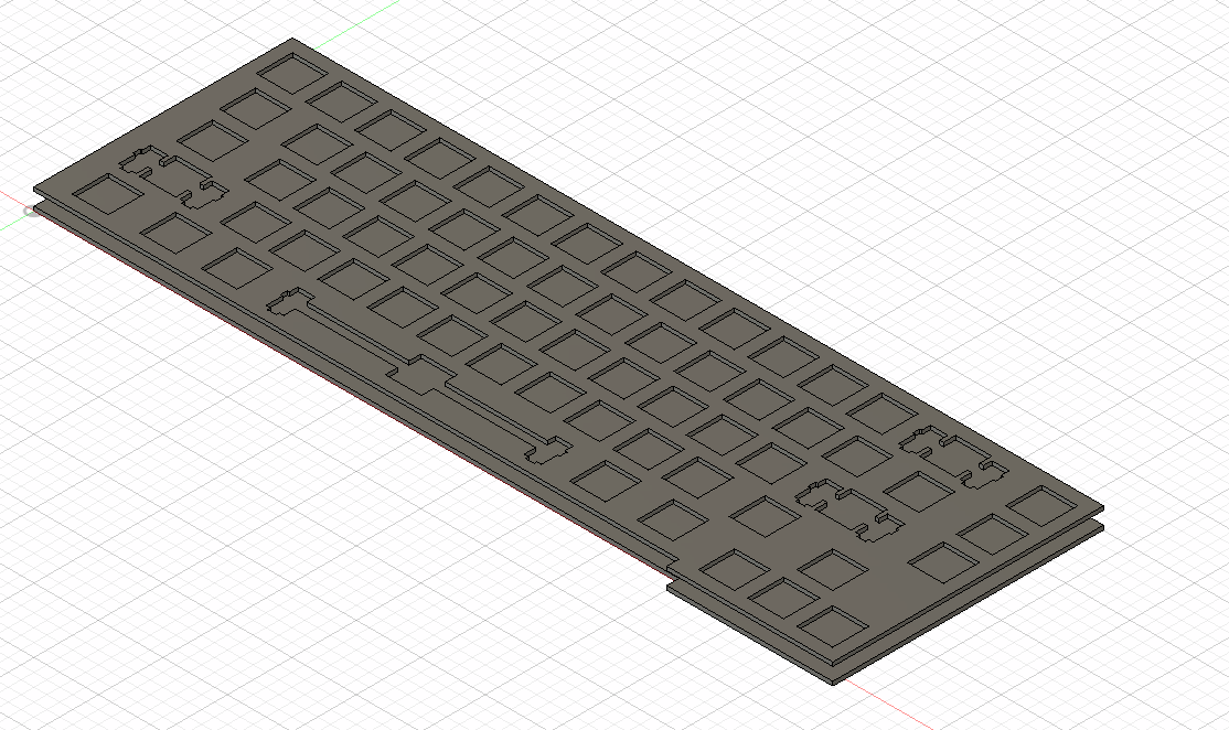
At this point, looking at the scale and the geometry of the offset arrow cluster, I decided it may be better to have no taper on the side and get rid of the inset between the middle and top of the board. I also decided to try making the sides a bit thicker than the front, but Im not entirely sure if that will make it in the final design.
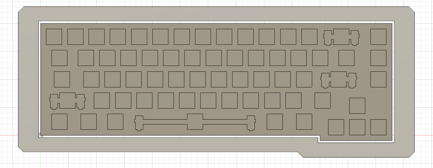
Then, some features to mount the top. I still wanted some definition between the layers so I added a notch along the seam instead of insetting it.
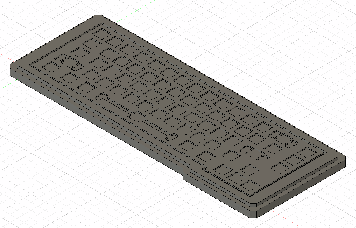
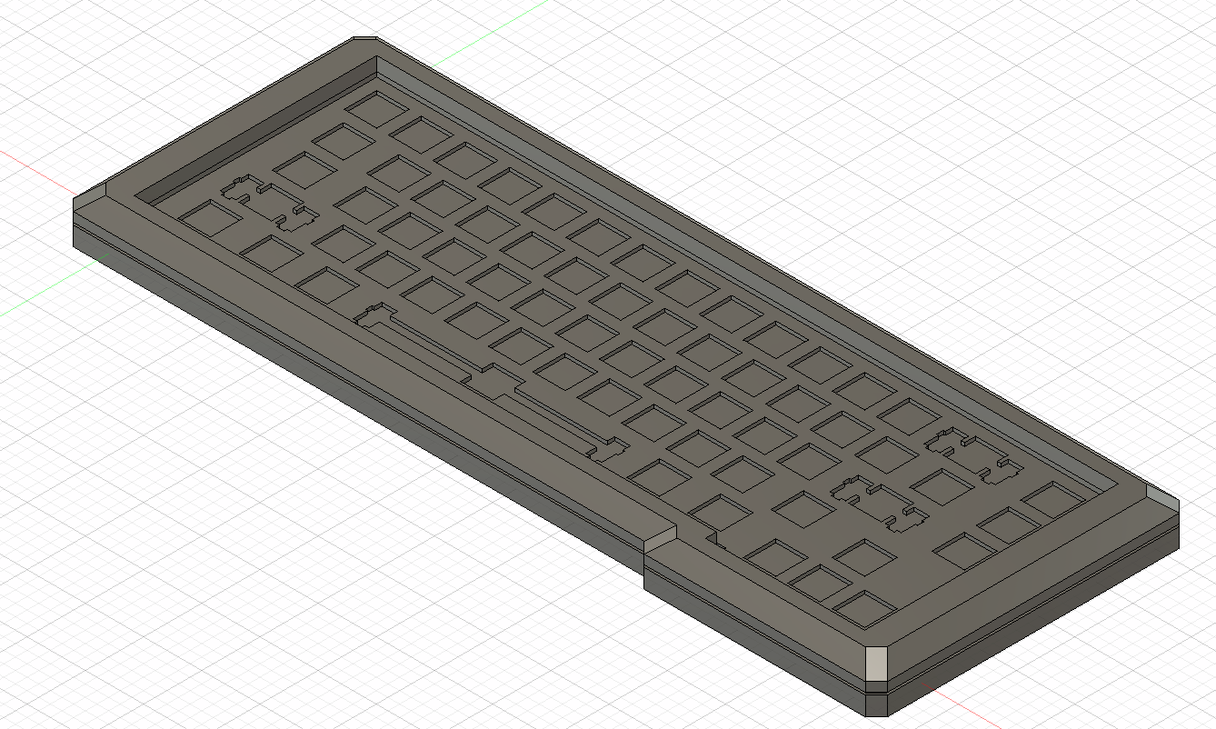
The construction of the top of the case follows the original plan with a taper to a flat edge on top.
Now comes the issue of the base of the keyboard. As of right now, the case itself has no bottom. I could just have it lay flat, but Im not entirely sure I like how that feels to type on or look at. I made a few sketches to see what style I think will work best and came up with a few ideas.
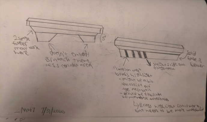
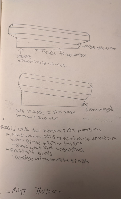
I ultimately decided on something akin to the second design shown for now, but some challenges were presented in terms of the geometry of lofting at an angle.
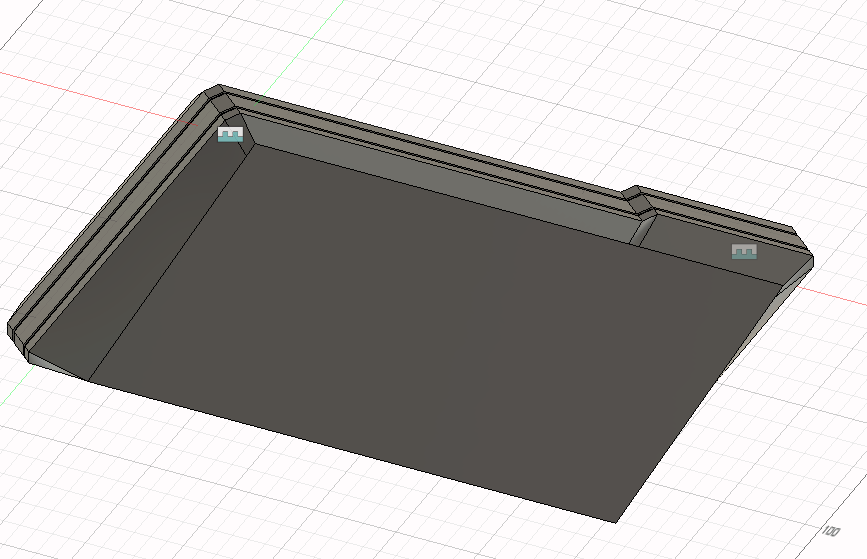
While this sort of curved geometry could work for some designs, it isnt really what I had envisioned for this. I would much rather that every face be planar to keep with the angular motif of the design. After playing around with 3d sketches and the patch workspace, I resolved each face to some triangles.
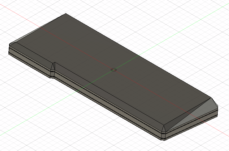
While this is closer to what Im looking for, I cant help but think that there must be a way to have the geometry work out with a normal loft to have the sides of the bottom of the case be planar quadrilaterals. If at all possible, I would like to simplify it to that in the future. As well, I can now see that there may not be any sort of need for a stepped bottom plate design (as shown in the above sketches) for this design. With this in mind, I think the last step for this proto-design is to go and refine some smaller things for the sake of visual consistency. Final images of the first proto-design for the Automaton65:
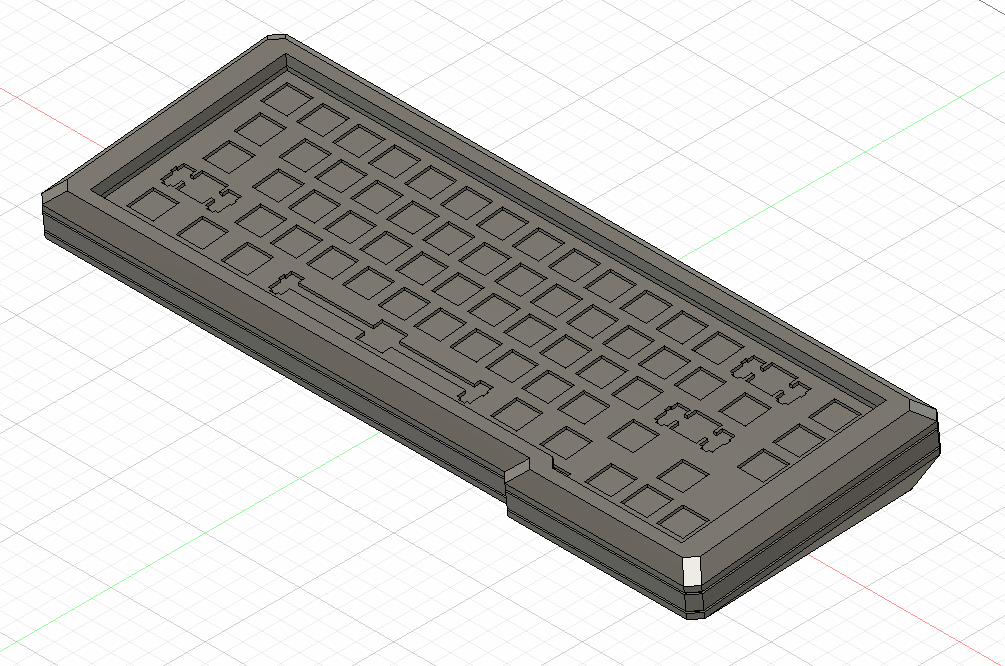

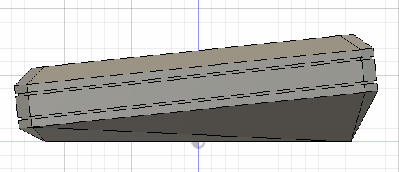
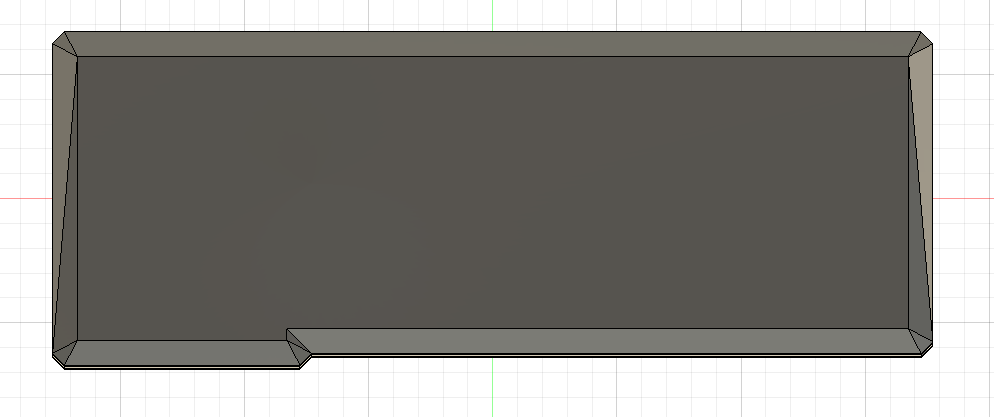
Ultimately, I think that while I am still far from what I would see as the final design, this quick-ish CAD prototype was an important step. Looking at this finished design, it is certainly geometric, but Im not sure how brutalist it is. In my final design, I am going to play around and try to fix the curved face issue. I could use a 3d sketch and then just set each set of sides to be parallel. As well, I dont love the 2 notches in the middle part of the case. They are meant to be a design feature to make the seam lines look a bit cleaner, but it just takes up too much of the space. I would also like to make what is currently the bottom of the case thinner and then have a secondary tapered segment.
_M47
8/2/2020
Given what I learned from the previous design, it is time for a bit of a different approach. I want to focus on creating the bottom piece of the keyboard out of concrete and have that be the focal point. This would mean simplifying the top of the board and creating a more complex design for the weight. Ultimately, I would like for this to be a truly brutalist-inspired keyboard, so I think it would work very well and be much more balanced to have a top piece that would stand out more but be less complex and have a weight that while less salient, is more complex.
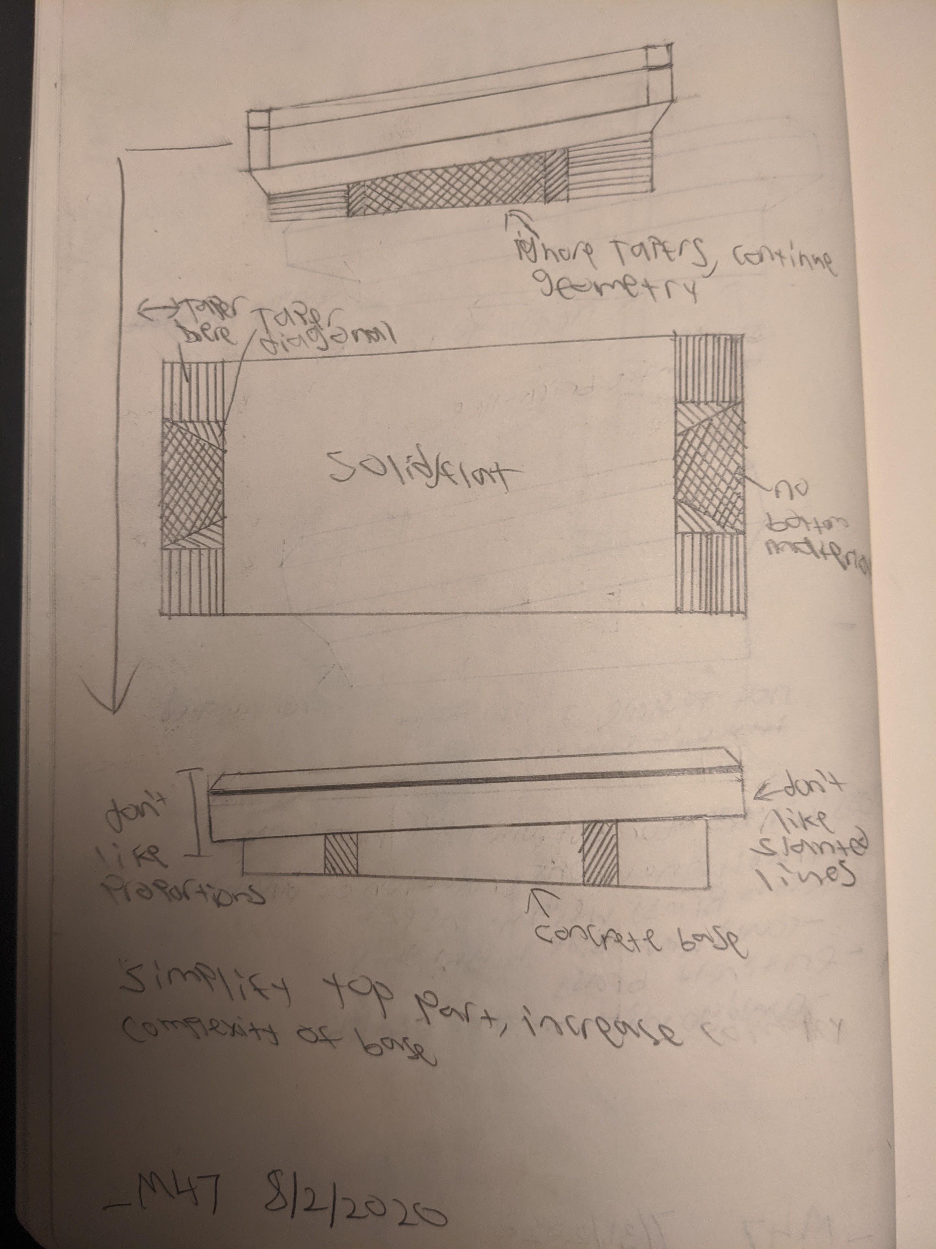
_M47
8/4/2020
Using the sketch I created, I created a second preliminary CAD model of the case. This time, I started with the weight. I like the overall look of this weight. It follows what I specified in the sketch, and also has a 6° angle. After thinking about it for a while, I believe that casting the weight in concrete is the way to get the brutalist feel that Im looking for (after all, brutalism is about concrete). As such, in the final version, I will add a draft angle to make it easier to de-mold. As well, one challenge I see is how to handle the outset arrow cluster on the right side of the board with respect to the weight. I chose to acknowledge but ignore the issue for this version to focus on getting something to show what the look would be without spending too much time on something that will not be final. Now that I know I like this design, in the next version, I will solve that issue.
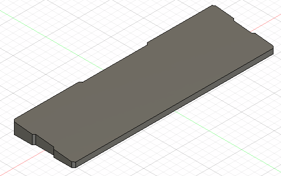
In terms of the upper part of the board, I think I am going in the right direction, but it isnt quite there yet. I think the biggest issues with the design involve the proportions between the elements. For example, the weight while it looks good on its own is way too small in relation to the top of the board. As well, the sizes of the chamfers and fillets on the board dont make any sort of visual sense. As well, there is some geometry that has to be resolved with them as the spots that they meet arent entirely clean. This iteration has also shown that the blockers that separate the arrow cluster from the main section will be a challenge to position correctly. Later in the process, it may become easier as I add switches and caps in the model to create a more realistic scenario.
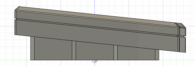
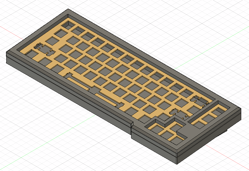
Overall, there are a few things that I am thinking about moving forward. First, is this the right layout for this idea? While I really like this 65% layout, it doesnt seem to totally lend itself to the brutalist look that Im going for. A more blocky layout without any offsets might make this easier, but I am not sure yet. I will try a few more ideas I have for this layout, but to preserve the design vision, the layout may have to change. As well, although I mentioned this throughout the log for today, the proportions of the components are a bit tricky but will be the deciding factor in how good any design is. As such, I will start to research the best way to go about making them correct. Lastly is manufacturing. Until now, I have been ignoring this aspect, however, as I move closer to the final design, this has to become a larger consideration. For example, with this design, the sidewalls of the top of the keyboard are straight up and down. While this could be a good design feature (if I get the proportions right), it will greatly increase the complexity of the work holding for the part. In addition, I need to consider how to go about attaching the concrete weight to the main keyboard.
_M47
8/10/2020
After thinking for a while, I think I have an approach. I will keep the top of the keyboard square for ease of manufacturing and have the sides of the base be parallel to maintain consistency. As well, to mount the bottom of the keyboard to the main bit, I will create a sort of clamping piece which will go around the concrete block. Screws will maintain tension and keep it in place with some sort of neoprene buffer.
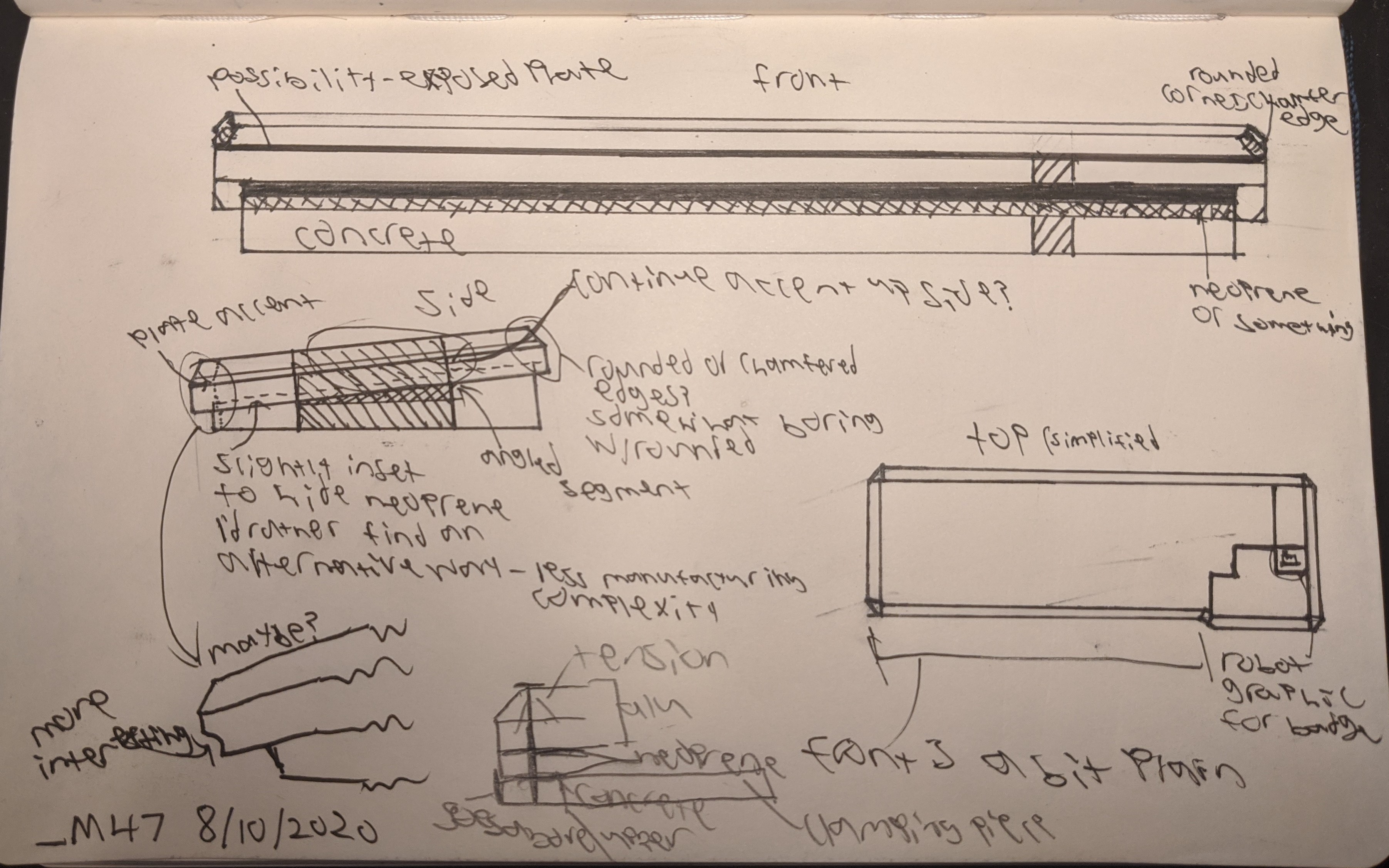
This is a bit of a shorter update but in the long run, this will be one of the more important ones as now I have a defined structural framework to build off of.
_M47
8/11/2020
Got around to modeling the idea in CAD. The black non plate part is the weight which I hope to make out of concrete.
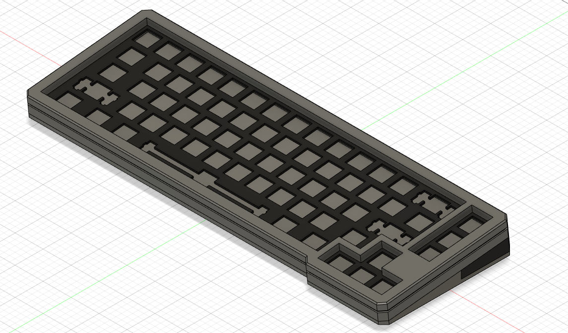
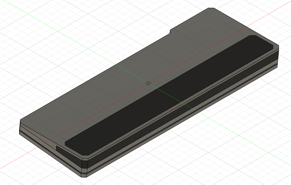

I think the clamping method will be the way to go to hold the weight in place, but I'm not sure that this is the form it will take. I don't really like the way that it wraps around the bottom adding more layers. I Think I would be better off using 2 separate brackets on either side of the block to clamp it down.
_M47
8/20/2020
Just a quick sketch of how the concrete block could be attached. This will be a bit simpler to machine and I think it looks better. Now the question becomes what is the best way to integrate the concrete? I don't want it to just be there for the sake of being there, rather to be a part of a cohesive design that it adds to and couldn't necessarily just be replaced by brass or stainless steel.
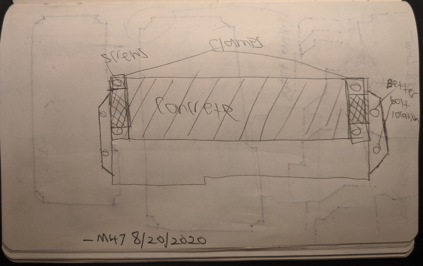
Here is another sketch that gives a side view of how the board will go together. note the neoprene layer between the concrete and aluminum. Whenever concrete is in contact with aluminum, I will need to add neoprene as some sort of layer to prevent scratching of the aluminum and cracking of the concrete. In addition, this will allow more surface area to be in contact to compensate for expected surface variance in the concrete.
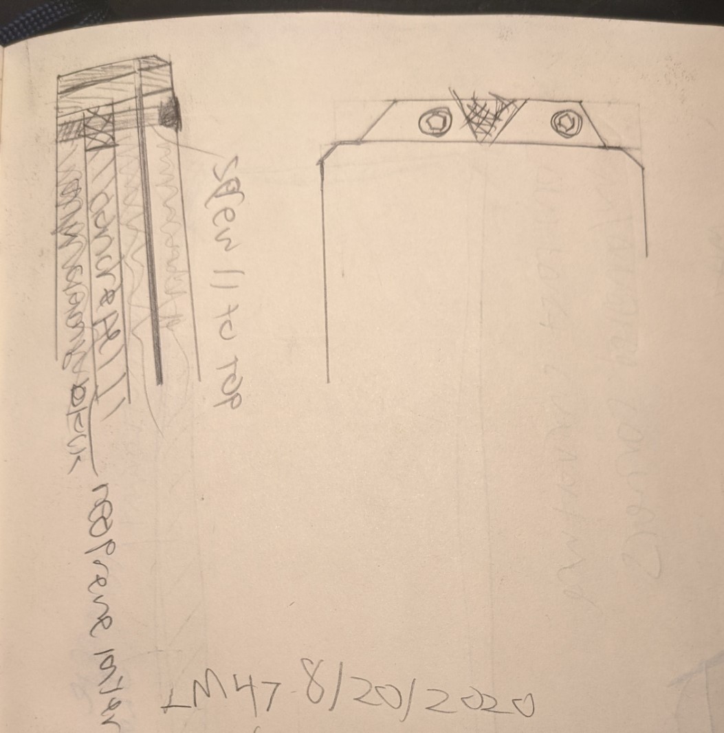
Going forwards, I want to start thinking more about adding a variety of forms to the composition as a whole. Looking at some examples of brutalist architecture, there is always some form of variety. No matter which angle you look, there is always something interesting with a lot of variance. I want to try to capture that in this project.
_M47
8/27/2020
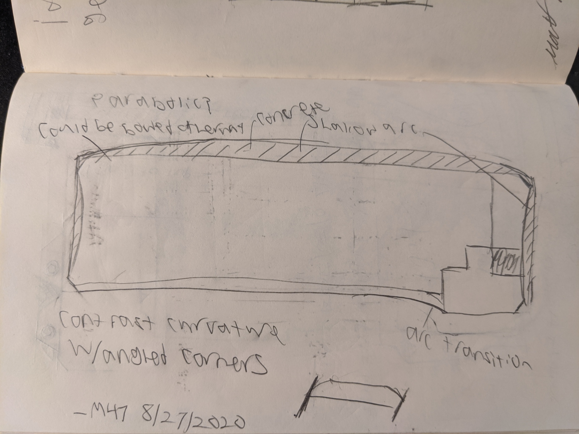
One approach I have is to reinterpret the design adding curvature instead of straight lines. Not that this is anything like what I would want the final design to look like, but when I'm stuck on something, I find that it is good to totally reverse the problem in some way and go at it another way. One thing that this did help me realize is that while I would like the arrow cluster to be separate from the rest of the board in some way, I don't think the way to do that is to have it stick out. This was a major portion of trouble, so I am glad to have some sort of way to move past it. While having the physically outset beyond the rest of the board may have made the board somewhat unique, I think I can find another way to get the same effect without the disjointedness of this sort of design
_M47
8/28/2020
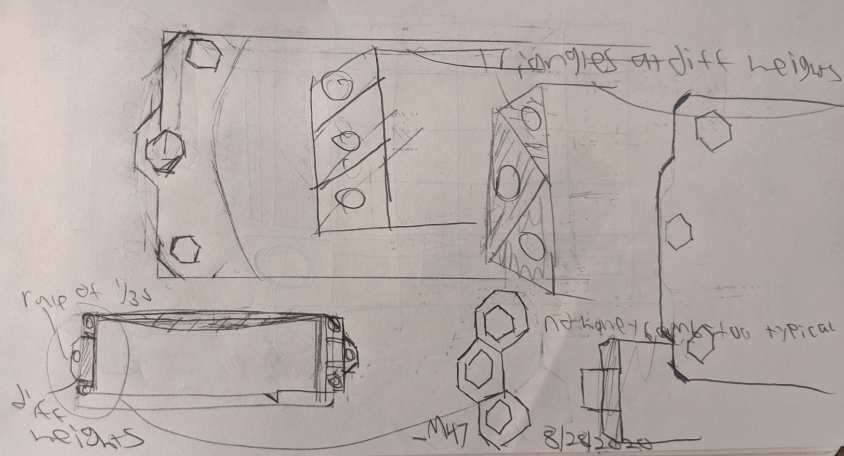
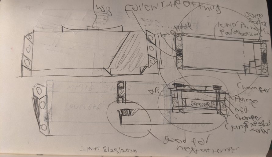
I still need to decide what each side of the keyboard will look like. To do this, I just started drawing any idea that came to mind. Some of these are good, some are not. I decided that I wanted something square to follow the motif of rectangles that would also accentuate the concrete while not making the concrete the only thing visible. I landed on a sort of overall architecture that I like, but I am not sure what variation of it I will follow. I want to have "tabs" that extend off the side for some amount and taper off towards the horizontal middle of the board. The screw will go through them and attach to the "clamps" on the other side to hold the concrete block. As well, in place of the feature having the case extend outwards around the arrows, I decided that an equivalent feature would be to have the edge squared around the arrow cluster, but chamfered along the rest of the edge. This would separate the arrow cluster while being within the design constraints.
_M47
8/29/2020
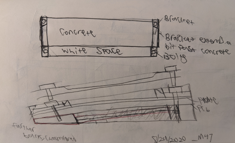
The goal is to add some more detail and thought to what I accomplished yesterday. There are two possibilities for the top of the keyboard. The first is to have the middle part be higher and the edges stay lower where the bolts are. The other is the opposite, have the center be lower than either side to allow for more strength at the cost of putting the screws up higher. One other issue is that at the front of the keyboard, I am unsure whether or not the concrete will be thick enough to have meaninful strength so that will be blank for now until I do some more research and evaluate it (potentially with some experimentation).
_M47
8/30/2020
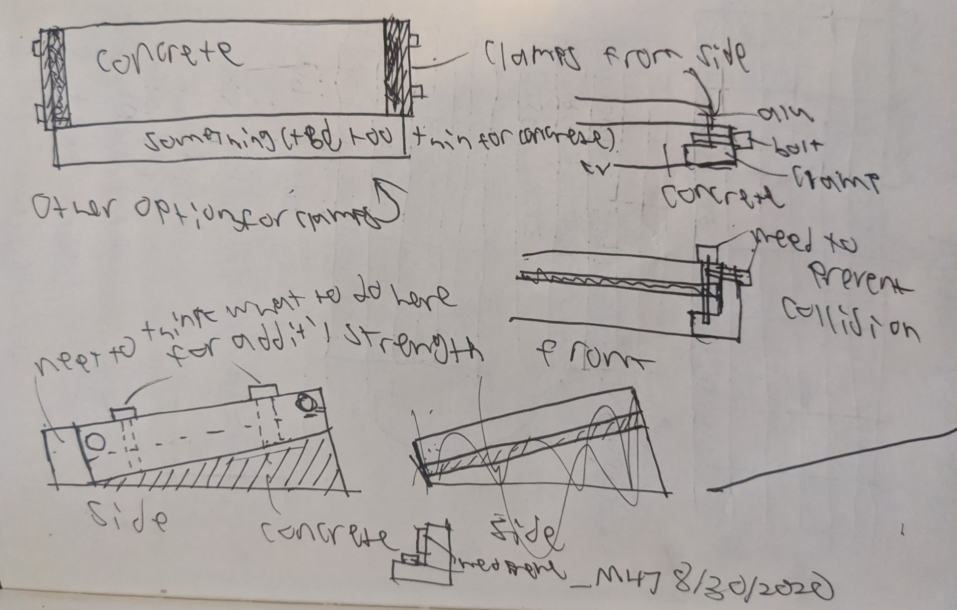
The focus today was thinking about the clamping system. One issue I considered was that 2 screws may not be stable enough as they can provide only 1 axis of tension. I thought that perhaps it may be a decent idea to consider adding some perpendicular screws to go into the top aluminum piece. While in theory this sounds like a decent idea, it will add another set of difficult manufacturing operations to a design that already has many semi-complex parts, so it may be better to simplify and only go with the 2 screws. While this idea will ultimately not be used, I found it was a good excercise and helped me fully understand how I want the clamping system to work. For example, there should be an edge that extends beyond and covers a few mm of the concrete to allow for alignment.
_M47
9/2/2020
Drew up a potential side profile in CAD today. I really like how it's coming along, and seeing this has added a lot of motivation to try and get this project done. The dark gray on the bottom is the concrete that will show. I like that it is a bit understated; it allows the concrete to be a part of the composition without being too much of a gimmick. Next comes the clamps and then the top of the keyboard. Note the bolts at the top. Ultimately, I am unsure whether these will stay. I liked the idea of having bolts stick up out the top, but that may be a bit too cluttered and take away from the rest of the board. I will still have exposed screws to go with the brutalist philosophy, but I may make them flathead screws to be flush with the top. As well, currently the design is based around a sandwich plate mount, but after discussing and researching, I think top mount will be the way forwards.

_M47
9/11/2020
Redesigned for top mount plate. As well, the side of the clamps will not extend all the way up along the keyboard, but this may change. Still trying to weigh the tradeoff between too much/too little concrete showing, machining cost, and potential stability enhancements.

_M47