

 Recent Posts
1
Interest Checks / Re: GMK Rainy Day (round 2)
« Last post by Rob27shred on Fri, 19 April 2024, 15:23:20 »Nice looking set.
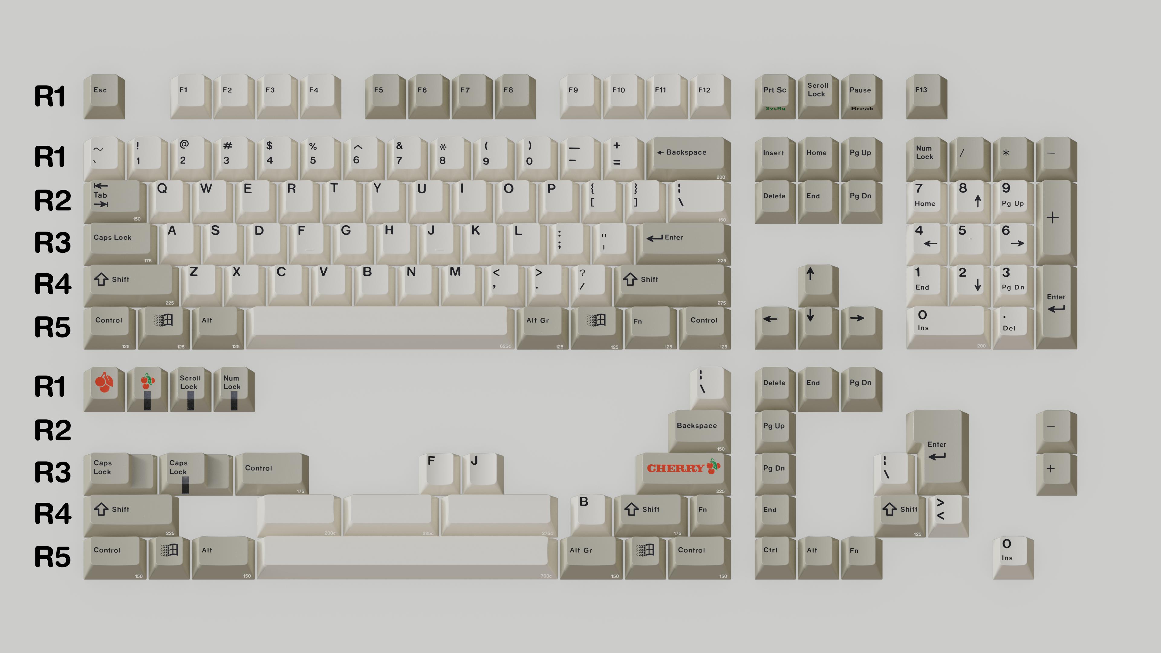
Any chance you'd consider classic legends for Print, Pause, and the numpad (at least just the number key sublegends/arrows). I think it tends to look nicer on icon+text modifier sets. While the cleaner look does seem to go better with icon-only sets. Admittedly, I did Print/Scroll/Pause on Dolch R5 before, but seeing it in person made me change my mind.
for example...Show Image
Also, I know it's not depicted as clearly on the render, but can we just make sure that Pg Up and Pg Dn, etc actually have the space between "Pg" and "Up/Dn"? Don't know if I've seen GMK ever go with it altogether, but sometimes they do seem to go with as-depicted renders so just covering ground there by mentioning it.
Otherwise, it's nice to see proper legends on 1.5u Backspace and stepped Caps Lock. :thumb: GLWIC/GB!
I second both suggestion Lightning made here. The classic legends with front print for print/scroll/pause definitely hit different IMO. Then I'm thinking it's just the renders, but I also would like to see a space between Pg & Up/Down on the finished sets.
 GLWIC/GB!
