Alright, so I've got a few designs up for feedback:
Arabic:
Show Image
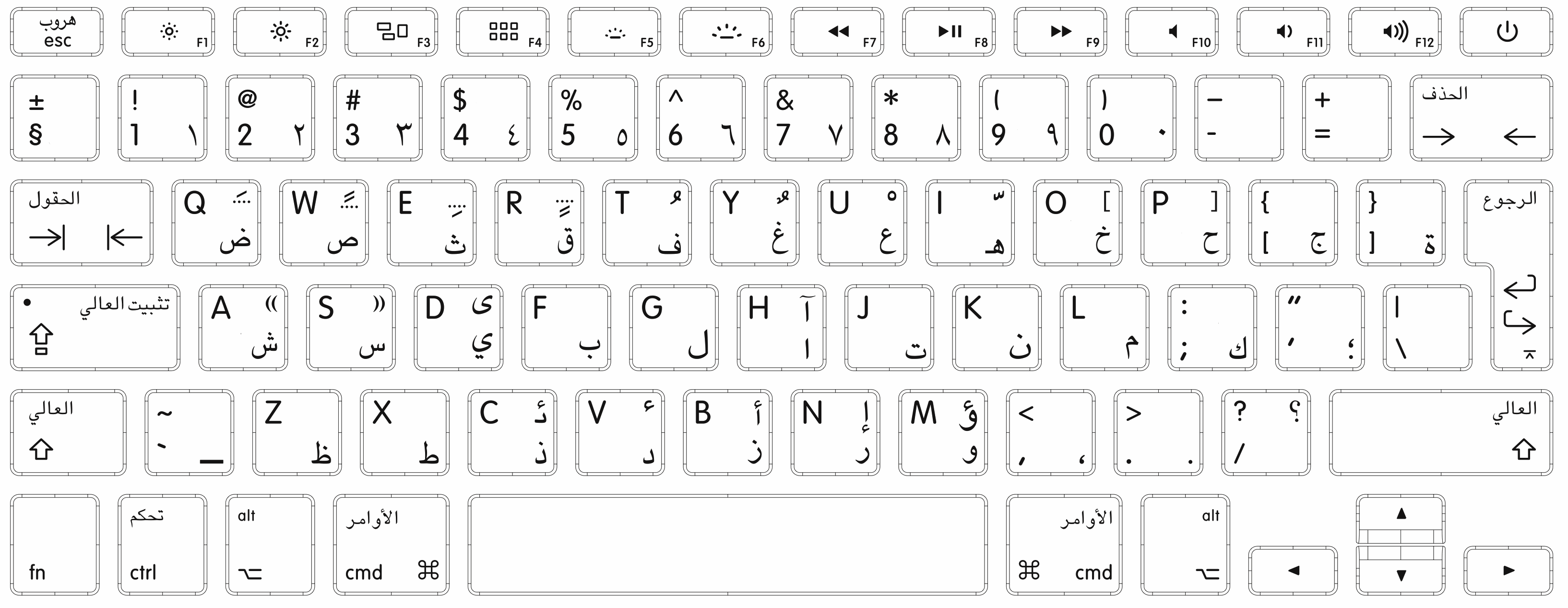
MOZ: I like what you did here with the Arabic legends!
Here is the thing. It is a mystery to me why some Arabic keyboards use the
isolated form of each character, while others like the Cherry G81-3000 use the
initial form.
Do you have any thoughts on this matter?
For example, you can see the difference between the two in this Wikipedia table:
https://en.wikipedia.org/wiki/Arabic_alphabet#Letter_formsI would have thought that the
isolated form is more "proper" (if there is such a thing) because it treats each letter individually instead of representing it as it would look like at the start of a word.
Also, the isolated letters look more beautiful to me. Here is the
Apple keyboard layout for Arabic as an example (which is probably not the greatest example since they use a very weird layout):
More
And here is a random keyboard I found... I liked the blue/white contrast, and this has a more conventional layout:

I think maybe I prefer the isolated form because there is more diversity in the letter shapes, which makes it more interesting.
On the other hand, there is a sort of smooth uniformity about the
initial form look, which makes it look sleek.


