IntroductionI was lucky enough to get a hold of a Nixeus Moda with Kailh switches. I have wanted to try Kailh switches for myself and this current review is my second foray into Kailh switches.
Please check out my review on the Keycool 84 for multiple opinions on Kailh switches. Unlike the Keycool board, this one has Kailh Browns switches. The Keycool 84 review has more information about the Kaihua switches. Since I covered that information previously, Im going to skip over that here.
Nixeus website describes itself as providing consumers
with multimedia solutions. They offer monitors, HDMI cables, media players similar to Apple TV, earbuds, and mechanical keyboards. The media players and earbuds seem to be discontinued though. After talking to a Nixeus representative, this is their first foray into making mechanical keyboards.
The Nixeus Moda is (almost) a tenkeyless keyboard that sports Kailh brown switches, as I previously stated.
Nixeus website for the Moda can be found here. These are switches have, as the Kaihua site states, brown shafts with ergonomic pressure points. Ill talk about the switches more at a later time.
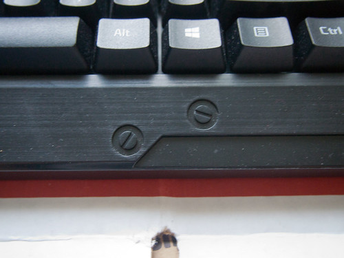
AestheticsThis one design choice bugs me so much about this keyboard that I wanted to point it out first. Why in the world do we have a hollow section with stiffening ribs?? Its literally a depression. I would *LOVE* to have it sport a screw-on cover like the top section. It is extremely unsightly and off-putting. Sure it is stiff and functional but I really dont like it.
In addition to these stiffening ribs, I am not a fan of the fake molded screwheads on the top of the keyboard. I think the board is going for this conglomerate of gamer, industrial, and pseudo-military styling. It just isnt for me. I do like the angles of the board but I really dont care for the random bolts or stripes on top. And I dont really know how the little blockers above the arrow cluster makes me feel. I vacillate between indifferent and dislike.
[/
The font on the keycaps and the logo is ok. I dont love or hate it but I wish it had more consistency. For example, the kerning on the o in Caps Lock is off and the a look off. So is the kerning on Esc, F1, and F10. If the font was more consistent, I think it would be better than the
Razer Blackwidow and
CoolerMaster Quick Fire Rapid fonts. The fonts are pad printed and it looks like the process needs some adjustment since the logos for the house and volume keys arent completely filled in.
If I ignore the bezels styling, I think the shape of the keyboard would actually be nice. It sort of reminds me of the Data911 TG3 keyboard (the cop car or police cruiser keyboard). I also like the textured bottom. The logos are simple, like the color scheme.
Finally, I like that the cable is not detachable and has a ferrite. Sometimes its nice just to not have to fumble with another cable and another bit.
BuildIm going to preface this section by saying I believe that the construction of the keyboard includes some form of bonding or welding. I couldnt figure out how to separate the case bottom to yield the PCB and case top for my inspection. I dont want to destroy this board so for now, it will stay together.
For all the things I dont like aesthetically with this keyboard, I actually think its solidly built. First off I think that the plate is a fiberglass one. It is not metal. That alters how the keyboard feels and I actually think it helps to dampen the vibrations a little. Sort of like how the drawer liner trick works in boards with metal plates. The plate also has an odd bump in it which seems to space the function row curiously. Im not sure of the purpose of it but it exists.
Something else I dislike is the stabilized keys on this board. It seems like theyre costar-esque but Im not sure how the caps are supposed to sit. I couldnt figure out how to reattach the stabilized key to the stabilizer wire. An issue if youre going to use the stock caps on say the spacebar. Also the stabilizer has gobs of yellow grease that smears easily everywhere.
 Picture of the backspace. Brightness set intentionally high to show cap detail
 Stabilizer, plate, and Kailh switch closeup
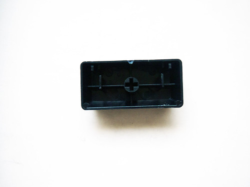
I believe the rest of the case and caps are ABS. Again, I dont want to do any destructive testing so I wont be doing the acetone test on either the caps or the case. I should point out that in addition to the stock caps, there are replacement WASD and arrow caps which are blue. And there is a little blue ring keypuller. The board overall feels solid and actually relatively hefty. This Moda weighs 1 lb 14.4 oz (848 g). Compare this to a stock Leopold FC700R with a metal plate, PBT case, and PBT caps which comes in at 2 lb 8.1 oz (959 g).
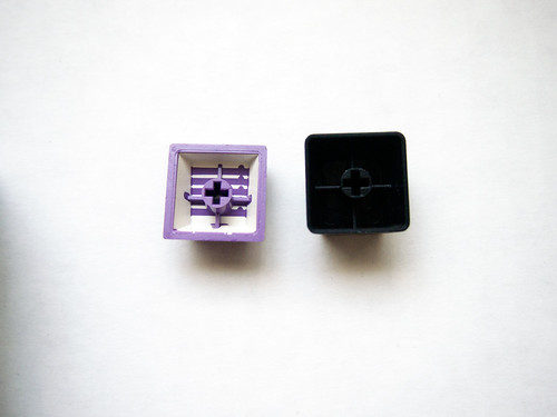 The Moda caps (right) are thinner compared to GMK caps (left). Brightness is intentionally set high to show the detail of the cap.
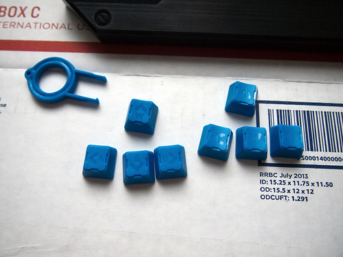 The Moda extra caps and puller.
On the reserve side, the Moda has two flip out feet for increasing the angle and four rubber pads. However in contrast the the FC700Rs feet, the Moda doesnt have rubber tipping. In use, I didnt have any problems with it sliding around I always like little details.
In terms of the layout, I actually like it a lot. I like how the navigation cluster and function row are close to the alphas.
Since I couldnt get the board completely apart, Im going to judge the rest of the board based on the breakout board. The breakout board is relatively thick. The soldering job is just ok. I think that the PCB might be better than the QFR but not on par with say a Ducky PCB.


