At this point, I'd settle for just the word "MOON" in a neat typeface instead of a logo at all. Typefaces can't be copyrighted. Also, you could ask the copyright holder for permission for one of the original logos.
Typefaces do actually have copyrights. The more famous ones can rather expensive too, with varying prices depending on your use case.
Also note that there are a lot of typefaces on the internet that are either pirated versions or just as blatant rip-offs of the originals as the logo designs in question.
So if we are to cancel this because the design borrows to heavily from existing work. Then we should do things correctly all the way, including typefaces. For example, some of riocs (please don't take this as criticism) designs use a typeface that at least are very close to the NASA font. Is the NASA font in the public domain, or have the owner given us the permission to use it?
My main point though is that it is very difficult to navigate the cluster**** that is copyright and produce something that is entirely unique. Especially when we get to such a high level of simplification and abstraction as these logos.
Would I prefer if the design were entirely unique? Yes.
Would I rather that the design looks good? Absolutely, any day of the week.
With that said, I'm not a huge fan of the now discarded designs. From an ascetics standpoint I preferred the original logo and the weight felt a little weak design wise. Though I liked it enough to join the group buy.
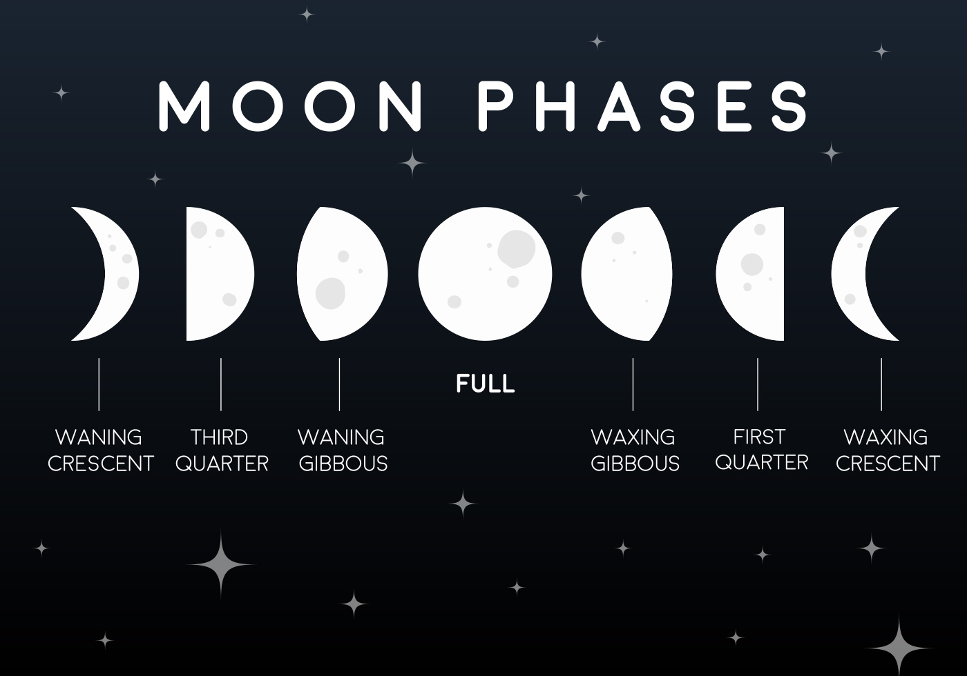
For the weight I like to propose using the moon phases like this.
Though I guess this could also be considered prior art.
But at least we have the fact that the actual moon phases looks like this.


