... Is there a way for SP to match the font thickness to the shift key at least?
I checked into this actually. But they have their molds set up for this legend already, and so I guess we get what they have. I assume it would be possible to do something custom, but it would add some cost to the production and slow it down a tad. (and a greater chance it could be messed up since it would be a first run.)
However, SP did send me this recently in relation to this question:
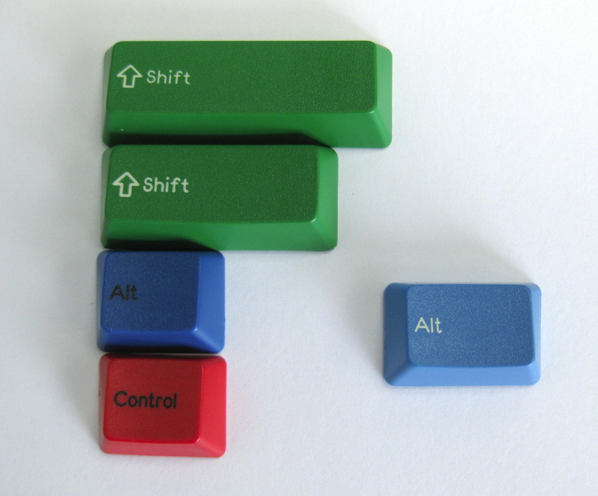
I have no clue what sizes or colors those are, but as for legends... that's some they made with the same legend setup. (Of course, all our legends will be white.)
However, there is variation within those to my eye: The top shift looks (slightly) thinner than the bottom. Not sure if that's the photo, different runs, or what. Also it looks like the Alt/Control on the left match thickness to the bottom shift, while the alt on the right is thinner. (though being black makes it hard to compare exactly.)
Either way, I've expressed that most importantly we want a uniform thickness. The slightly ticker font looks better to me and should match more boards. But I'm not sure we get to choose that in this scenario.
The joy of group buys, you never know *exactly* what you'll get.


