Show Image
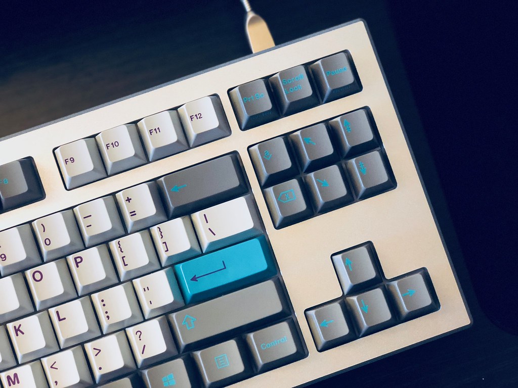
Is this just really contrasty, or did you run darker hyperfuse with icons?
Depends on the lighting, that picture in my mind exaggerates the contrast quite a bit, while Originative's photos reduce the contrast a hair.
Also, having Ocean Dolch (same color mods as OG Hyperfuse), the Redux mods aren't really lighter than OG mods, but are cooler. I think the Redux mods play a bit nicer with the cool silver color that clear anodized aluminum has. Also, it was a good move on Sherry's part to go with icons vs text, as the icons seem easier to read in TU2 on this new gray than had it been text.
It's quite a beautiful set in person, and pairs excellently with silver aluminum.
Here's a photo of my set:
