The up arrow in icon next to the shift in this picture:
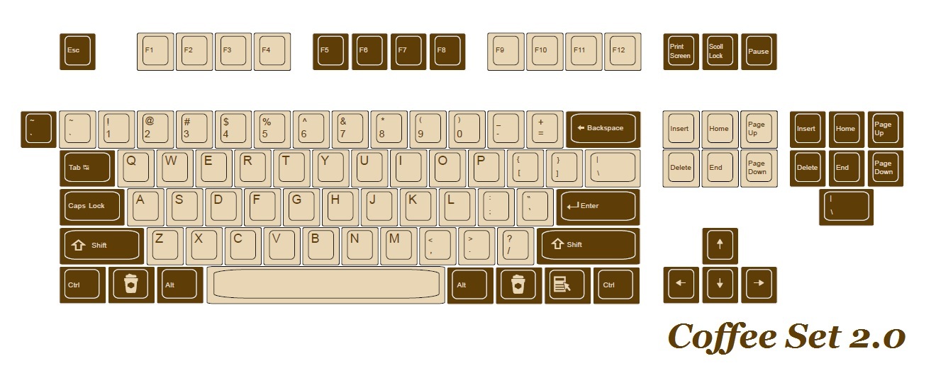
is relatively much larger than the up arrow icon in this picture compared to the word "Shift":
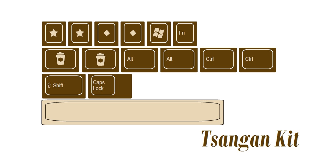
Will this be adjusted, is this a mistake in the rendering, am I seeing things, or will the final keycaps be like this?


