Recent Posts
11
Signature Plastics / PimpMyKeyboard / Re: Running a Group Buy through PMK - Logistics?
« Last post by Apexina on Tue, 28 July 2026, 04:18:23 »You will have to pay massive Import VAT (19% Mehrwertsteuer) and Customs duties on the wholesale value of the entire shipment when it enters Germany.


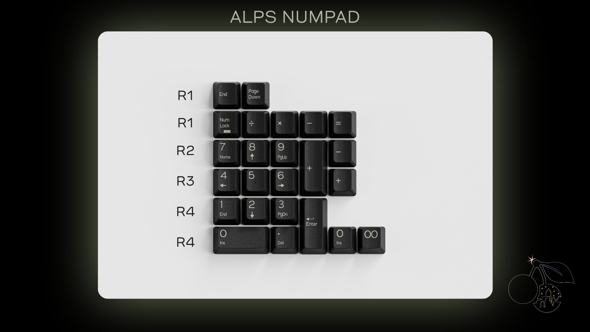
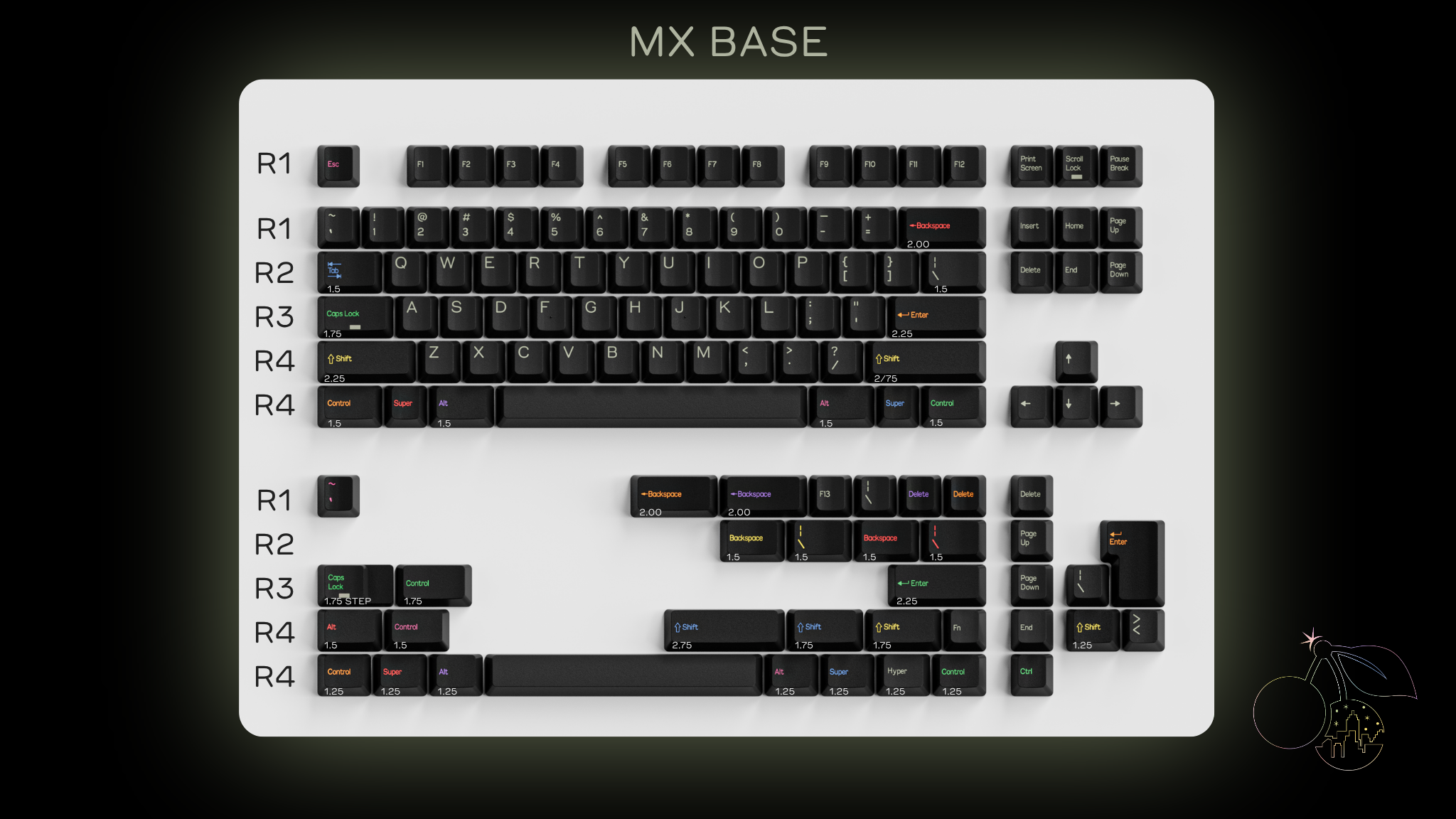
 Great for macro columns or anywhere else you want!
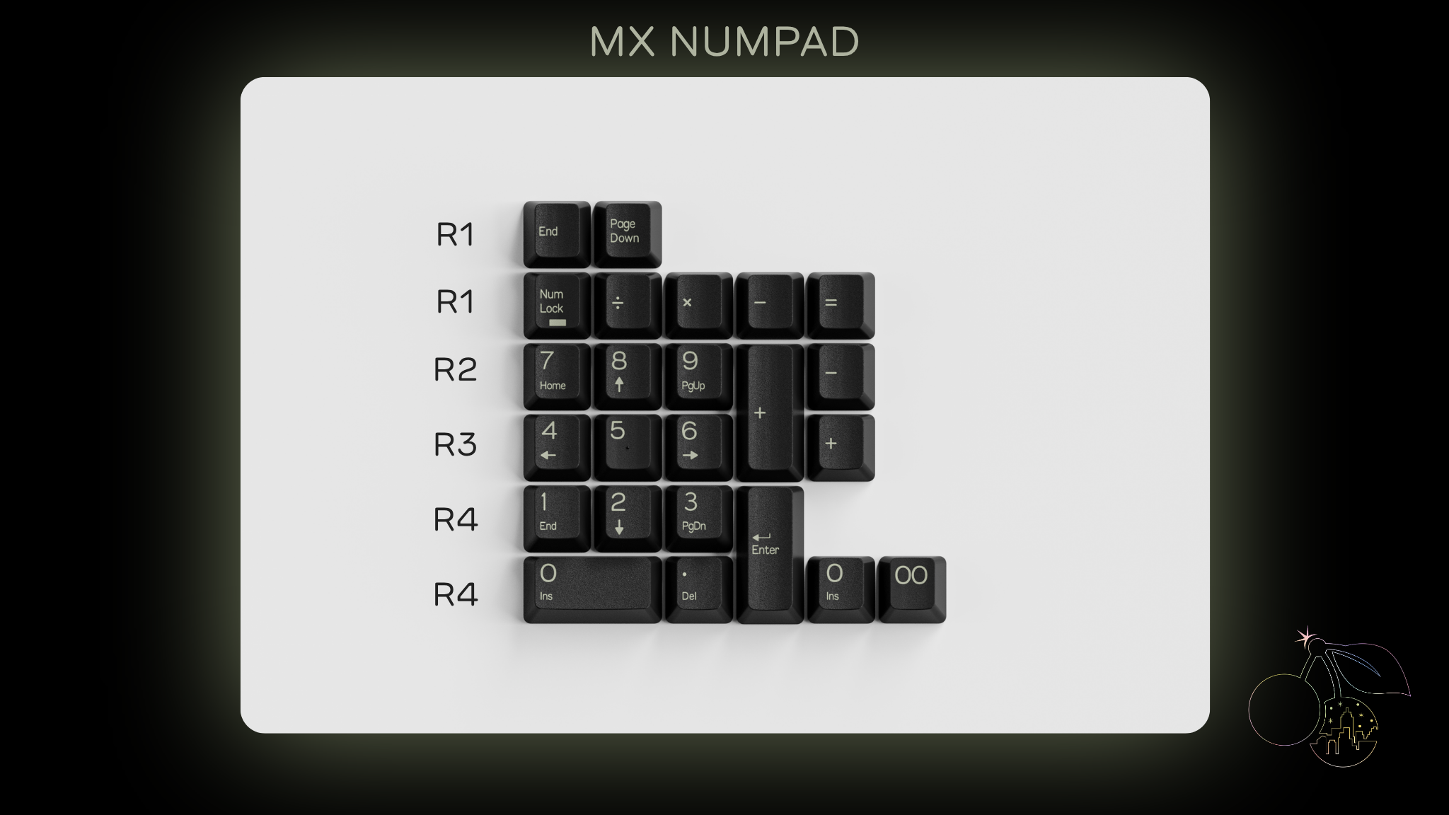
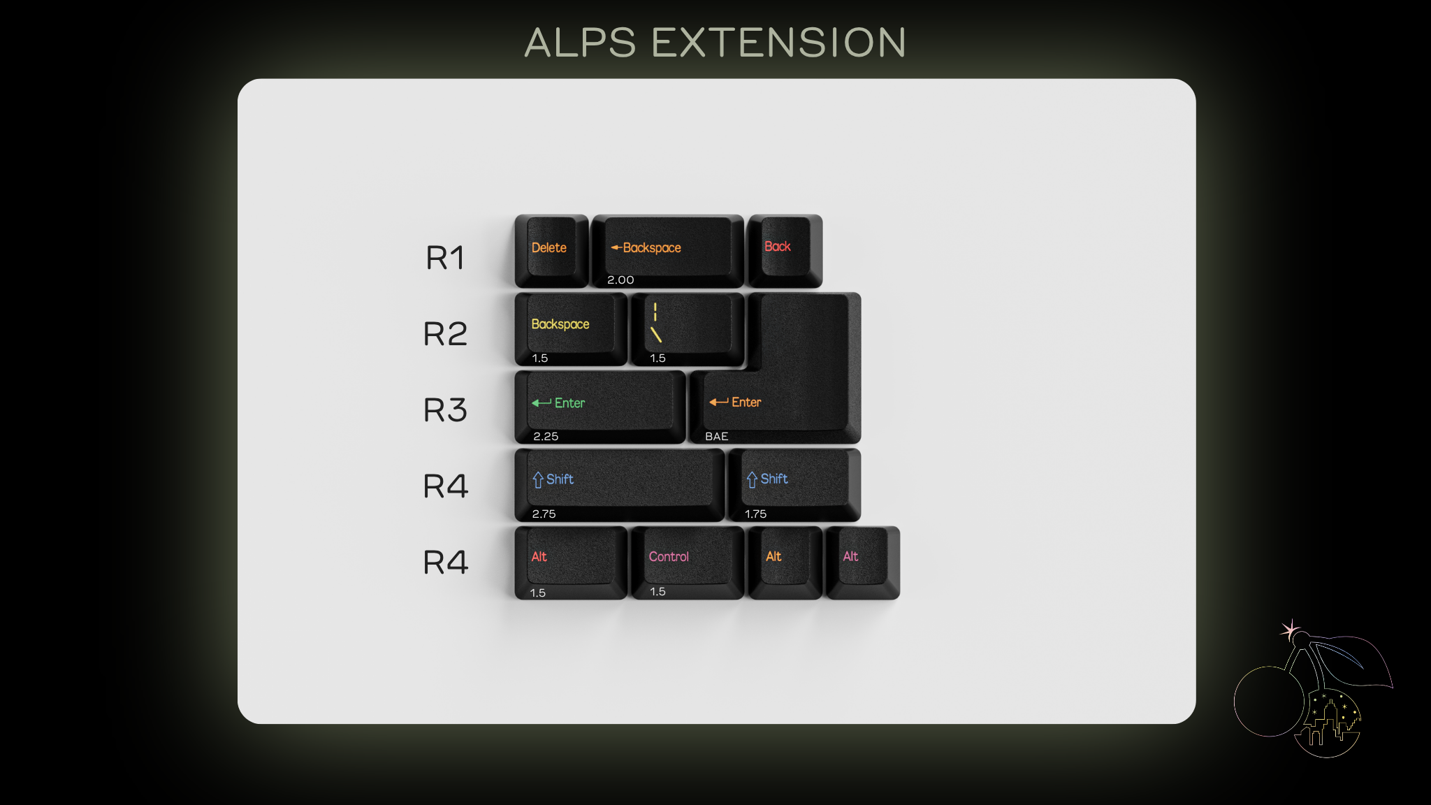