You may very well be right about color theory, but I think the problem is that you're mapping colors to functions without adequate regard for the placement of the keys... You are paying a lot of attention to visually differentiating mods and nav keys, control keys, G and H, and so on, which makes sense logically but it just doesn't look right on a keyboard. Also I don't think "blacking out" keys to de-emphasize them looks good. And IRL I think it will look even less good than on the WASD previewer.
How would you guys design a color palette that isn't the same standard look as most stock keyboards, feels a bit more colorful and fun, but isn't "unicorn vomit"?
Here are a couple ideas drawing on your examples, but simplified.
Show Image
Show Image
Ahh, so it's the highlighting/separating each of the modifier and navigation keys and the GH keys that is the main culprit for you. For me, that approach is the most logical and efficient, because it makes jumping between all the important landmarks on a keyboard much easier/faster for me. So the way I design the colors has to implement that approach, otherwise, I might as well just get a normal looking keyboard.
The habit started for me a few years ago when I got the idea to use enamel paint on my keyboards to differentiate the keys according to my way of thinking, like in these photos:
https://geekhack.org/index.php?topic=66431.msg1556388#msg1556388It's stayed with me ever since. Now, I don't paint the keys like that anymore since it's a PITA to maintain, but I do stick little colored strips to the front of the keys to highlight them, like in this photo:

I color my RGB keyboards with the same approach:

The WASD custom keycap colors are basically an extension of that habit--one that has made my keyboard usage much more efficient than without.
I don't know if you guys have ever studied color-theory, but having more than a couple of colors doesn't automatically make the color palette "unicorn vomit."
Ive studied color extensively for >10 years (as a photographer, information designer / user interface designer, and in general fan of human color vision), including plenty about various theories of color harmony, and I think all of these look like someones bad acid trip.
Edit: to clarify, the problem is that theres no clear vision or reason behind the choices. Its just a jumbled mess of unrelated (in the first post directly clashing) colors. What are you trying to express with this color scheme? If you want the keycap colors to just be a diagram showing where different blocks of keys with different function types are, Id recommend a much more conservative and more closely related set of colors. (But then, the better question is maybe why would you want your keyboard to look like a diagram showing various functional key blocks? Its not like youll be able to productively use that in practice while typing.)
Not when I'm just touch-typing, but when I jump between different content-creation software where lots of hotkeys are used in each (art/design/photography, audio/music, video editing/compositing, etc), being able to visually identify different function blocks or even within each block, speeds things up for me or simply is less taxing for me when my brain's already working too hard at squeezing out every last drop of creativity I have for the project I'm working on.
As for the color palette, I think maybe it's just part of what I gravitate towards when it comes to colored lights and physical controls in general. I mean, take a look at one of the music production studios I designed/built:
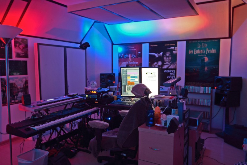
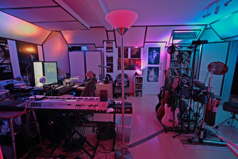
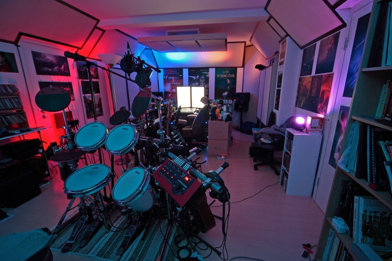
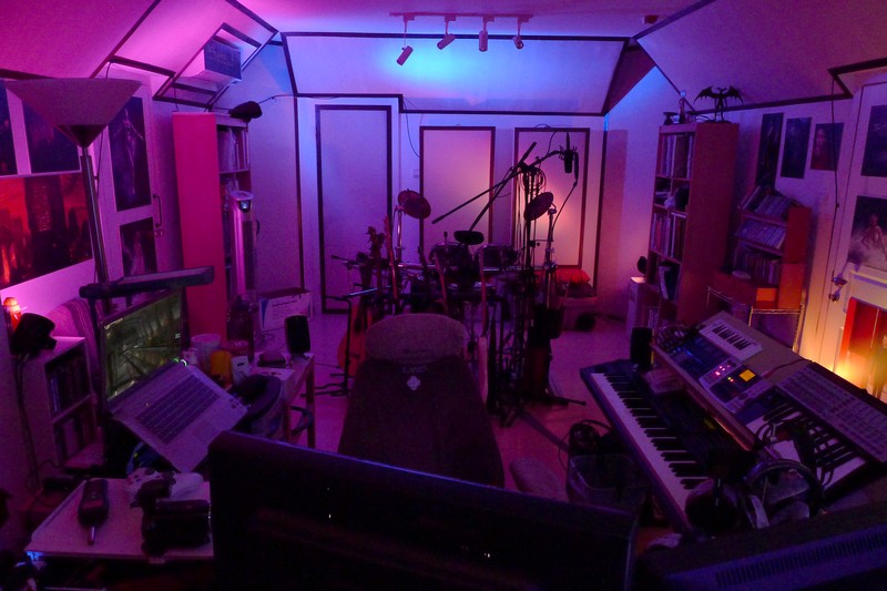
Seeing a pattern yet?

Outside of LED lights and control knobs/keys, I actually have very earthy preference in wardrobe, car, and home furnishing--lots of black, gray, beige, brown, white, etc. Not a single bright/vivid color in sight. Maybe the colorful keycaps are there to balance out my earthy palettes in daily life?


